
Vintage Inspired Bathroom Reno & The Moody Blue Paint Color We Chose
If you’ve been following along via Instagram over the last several months then odds are, you’ve probably seen the bathroom project we’ve been slowly chipping away at. For this space, I have really been leaning into that vintage-inspired and collected feel, while embracing pattern play and color!
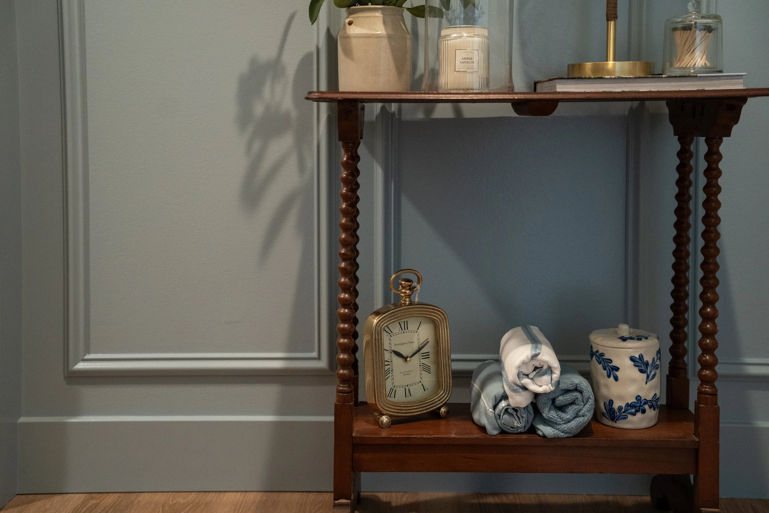
During the design phase of this project, I leaned into wallpapers, moody colors, and timeless fixtures that felt collected (like little treasures passed down from your favorite aunt). I didn’t want to miss this opportunity to really go bold in this design plan.
Traditional, but not too polished
Layers that feel gathered over time
A little bit moody, a little bit soft
Mixing structure (millwork, tile) with charm (textiles, wallpaper)
Wallpaper Direction
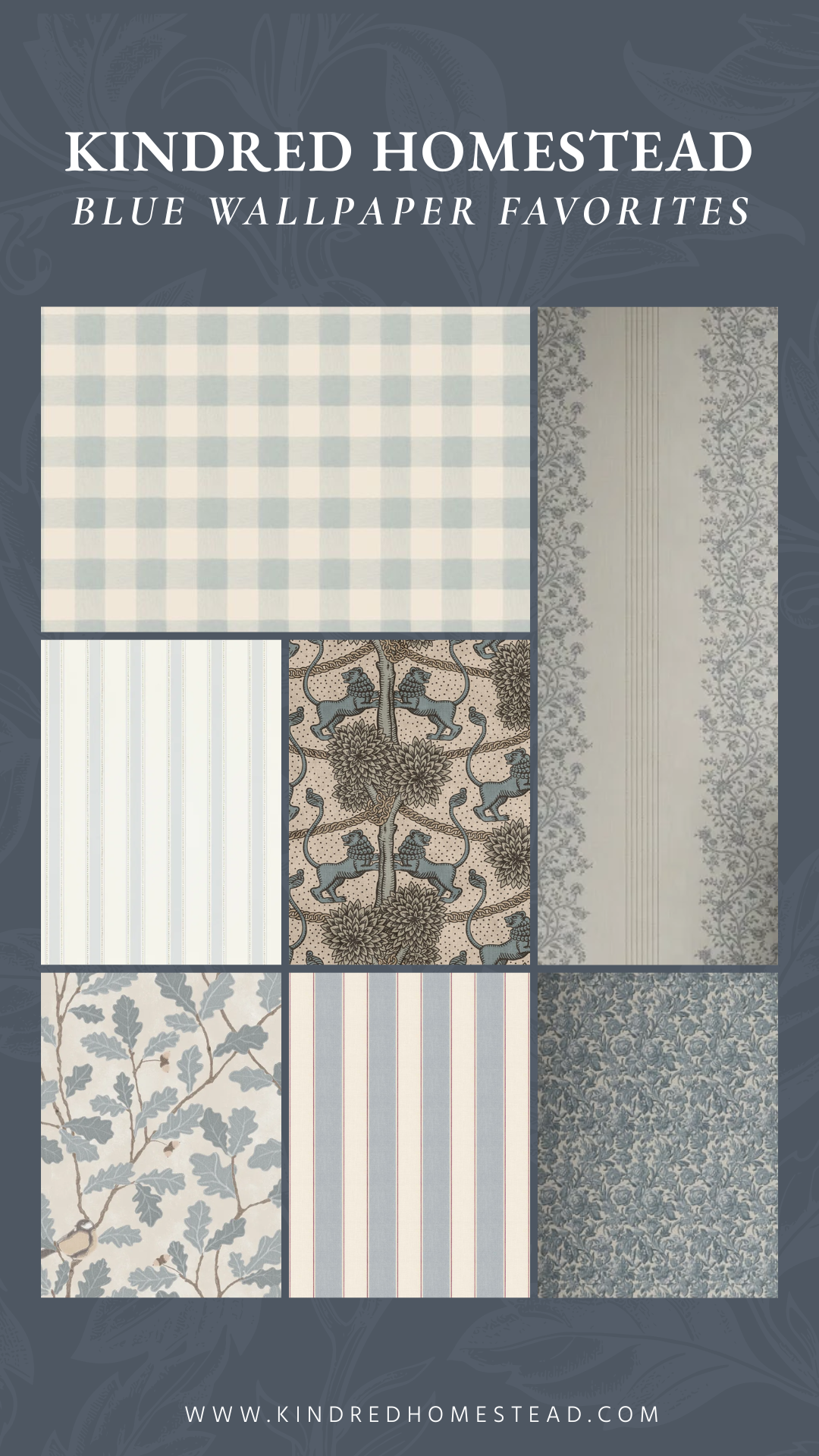
I went back and forth on the wallpaper decision for a while, knowing I wanted blue, I just couldn’t nail down the exact style I was wanting. I wanted something that was classic but still felt playful.
The options I ultimately feel in love with were: the soft, light gingham print and the stripped + floral print. Both felt like a subtle nod to days gone by with a slightly cottage-y feel.
And when I couldn’t decide between either of them, I decided to do BOTH!! The stripes felt timeless and paired with the gingham it added just the right amount of charm and play.
Here are a few other wallpapers we considered:
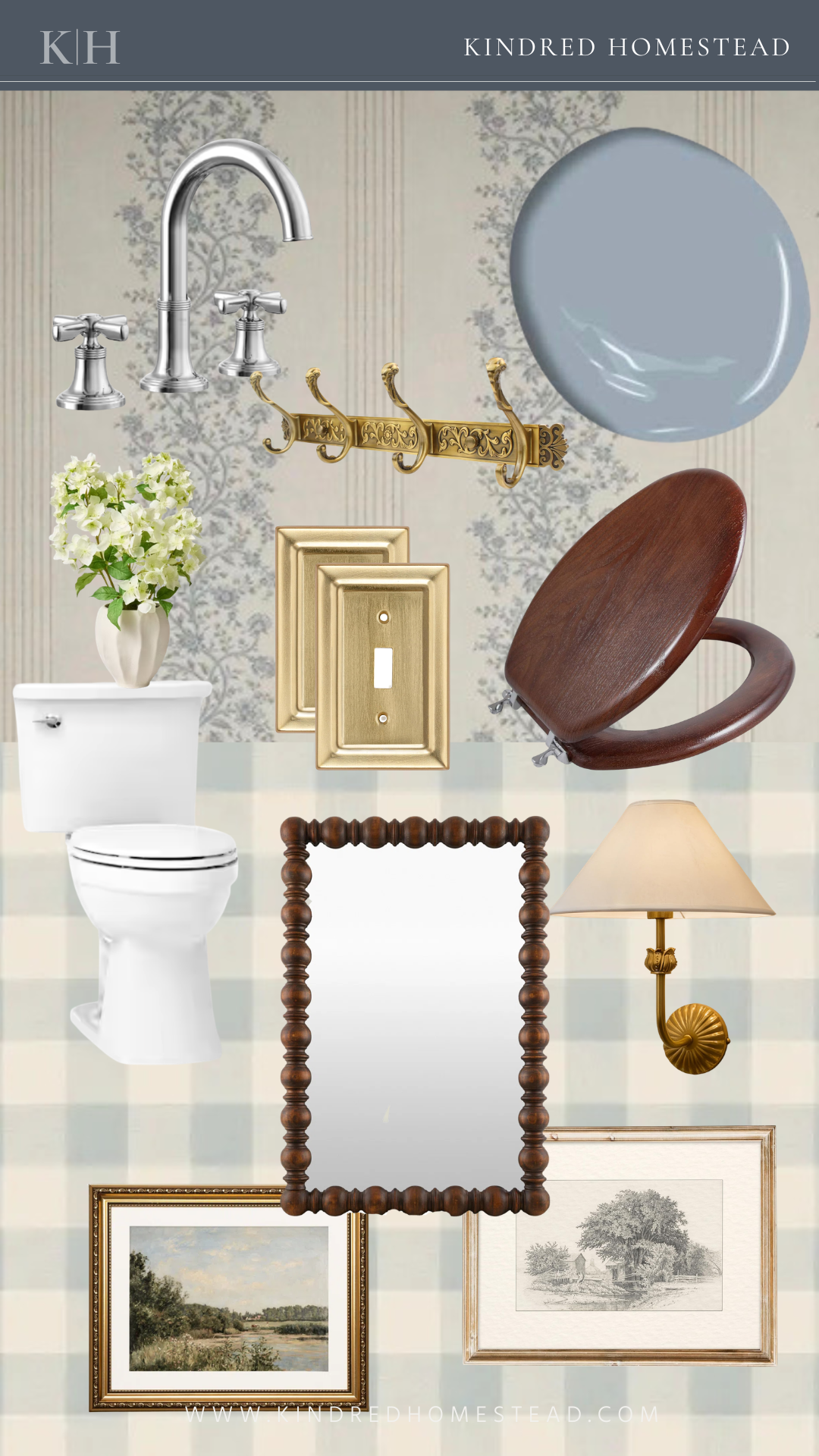
The Blue Paint Color
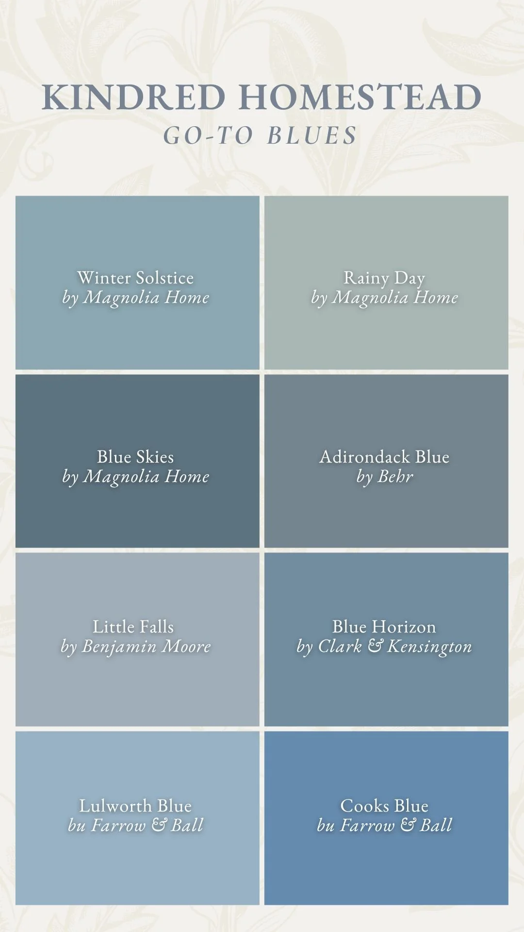
For the paint color, I wanted something that would seamlessly ground and elevate these to wallpapers together. This process wasn’t easy! The wallpapers have slightly different blue tones in them making finding that in between blue color a little tricky!
But why stick with blue if the wallpapers didn’t match completely??
To me, blue feels timeless and cozy, it pairs beautifully with brass and wood, and it adds depth without feeling heavy. After a lot of paint swatches and trips to the store, we ended up landing on Little Falls by Benjamin Moore, a color that feels straight out of a story book. A balanced mix of gray and blue creates this hazy, mid-tone shade that pairs perfectly with both wallpapers.
Below are a few other blue paint colors we tried out:
This space is really about balance—structured yet soft, moody yet light, vintage yet livable—and the blue is what quietly holds it all together. Stay tuned for the full reveal of this space!